vercel-img
Fork of svelte-img for use in conjunction with Vercel optimized images.
Visit Github RepoRender the bare minimum, minimally invasive, LQIP-included HTML code to represent responsive images, served in multiple widths and next-gen formats.
Also allow opting into using Vercel image optimization for the transformed image, instead of generating all permutations locally.
Install
$ npm i -D @leoj3n/vercel-imgAdd imagetools plugin into your vite.config.js:
import { defineConfig } from 'vite'
import { sveltekit } from '@sveltejs/kit/vite'
import { imagetools } from '@leoj3n/vercel-img/vite'

export default defineConfig({
  plugins: [sveltekit(), imagetools()]
})
Use
Anywhere in your svelte app:
<script>
import cat from '$lib/assets/cat.jpg?as=run'
import Img from '@leoj3n/vercel-img'
</script>
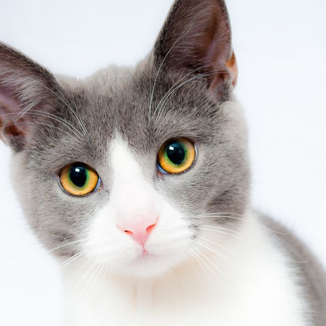
<Img class="cool kitty" src={cat} alt="Very meow" />Vercel
If widths is passed to Img then a single img
element will be generated, and it will have an srcset with matching
widths
linking to Vercel like /_vercel/image?url=...&w=480&q=100 480w (note that in dev
mode the link will be to the local image for all widths as they may not exist on Vercel until
deployed). You can additionally pass quality for Vercel to consume. Any image type
variants will be ignored, and if there are size variants, the largest will be used. See
Image Optimization with Vercel for more info about the URL syntax.
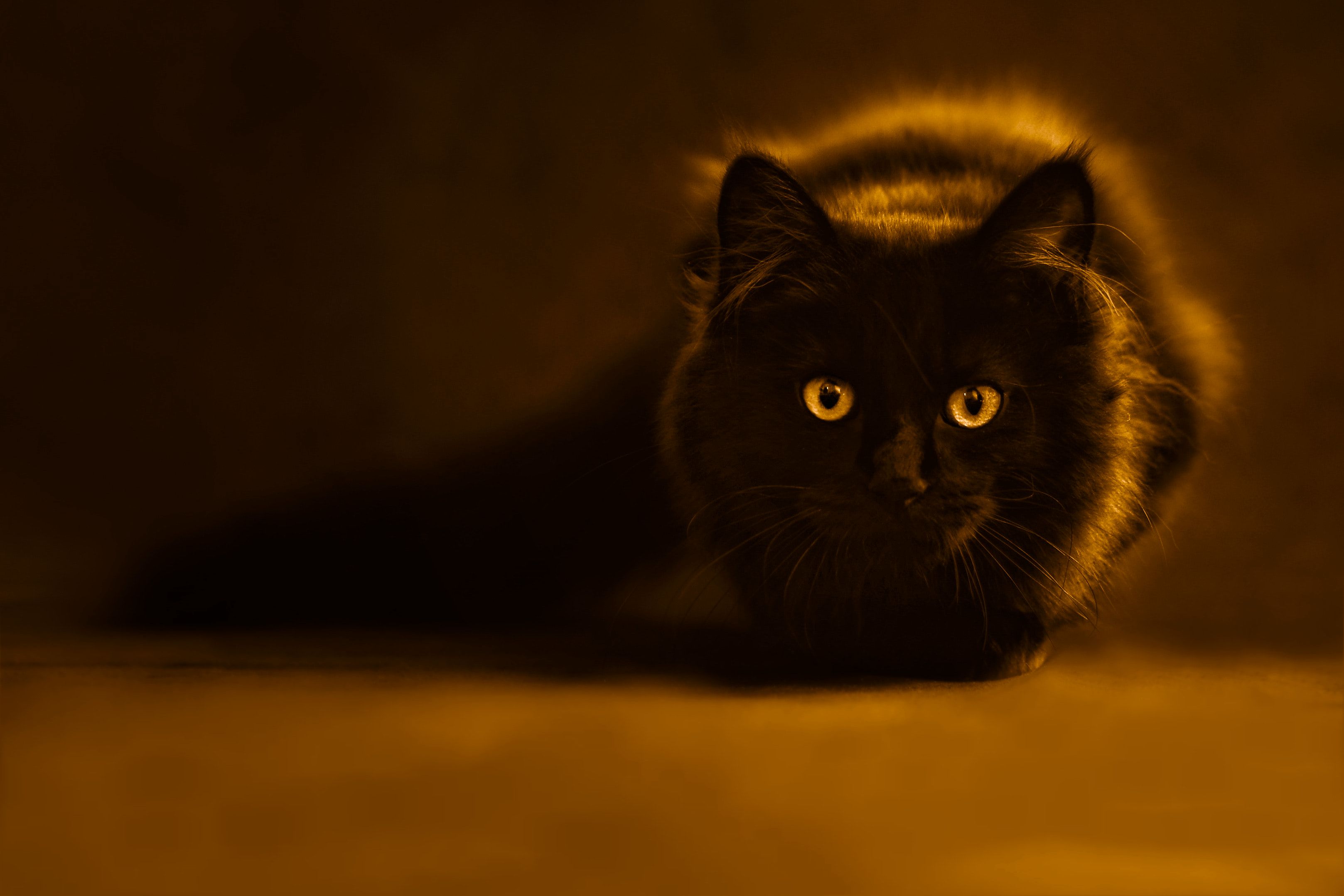
<Img src={hero} alt="cat" widths={PUBLIC_IMAGE_OPTIMIZATION_SIZES} />Note: Inspect the above image to see srcset using
/_vercel/image?url=.... Also check the document head and look for
<link as="image" rel="preload" ...
to see that this image is also preloaded using the same srcset
values.
For Vercel image optimization to work, the widths passed in to Img
must match what you have put in your
vercel.json for sizes:
{
  "sizes": [480, 1024, 1920, 2560],
  "routes": [
    {
      "src": "/immutable/.+",
      "headers": {
        "cache-control": "public, immutable, max-age=31536000"
      }
    }
  ]
}
Or sizes in svelte.config.js when using
@sveltejs/adapter-vercel:
import adapter from '@sveltejs/adapter-vercel'
import { vitePreprocess } from '@sveltejs/vite-plugin-svelte'

/** @type {import('@sveltejs/kit').Config} */
const config = {
  preprocess: vitePreprocess(),
  kit: {
    adapter: adapter({
      images: {
        minimumCacheTTL: 300,
        formats: ['image/avif', 'image/webp'],
        sizes: process.env.PUBLIC_IMAGE_OPTIMIZATION_SIZES?.split(', ').map(x => +x) || [],
        domains: []
      }
    }),
    alias: {
      $static: './static'
    }
  }
};

export default config
You can read more about the Vercel image value definitions.
Notice we are using an environment variable to get the allowed Vercel optimization sizes so we don't have to hard code the values and can update them in one place.
This variable is defined in
.env
like PUBLIC_IMAGE_OPTIMIZATION_SIZES="480, 1024, 1920, 2560". The
Img
component will split on any comma-space-separated string passed as widths in the
same way as can be seen in the config above. You may also pass an array of numbers as
widths which means instead of an environment variable you can create a file in
lib such as ./src/lib/allowed-vercel-image-sizes.js that exports like so:
export default [480, 1024, 1920, 2560]
You can then import that in svelte.config.js:
import adapter from '@sveltejs/adapter-vercel'
import { vitePreprocess } from '@sveltejs/vite-plugin-svelte'
import allowedSizes from './src/lib/allowed-vercel-image-sizes'

/** @type {import('@sveltejs/kit').Config} */
const config = {
  preprocess: vitePreprocess(),
  kit: {
    adapter: adapter({
      images: {
        minimumCacheTTL: 300,
        formats: ['image/avif', 'image/webp'],
        sizes: allowedSizes,
        domains: []
      }
    }),
    alias: {
      $static: './static'
    }
  }
};

export default config
As well as whenever you need to pass widths to the Img component to trigger
Vercel optimized images:
<script>
  import hero from './assets/hero.jpg?tint=ffaa22&as=run'
  import allowedSizes from '$lib/allowed-vercel-image-sizes'
</script>

<Img
  alt="cat"
  src={hero}
  preload={true}
  widths={allowedSizes}
/>
In this way we can generate a locally transformed image that will then be optimized and cached
by Vercel on the edge. Don't forget to pass sizes to Img as well to
help the browser know how big the image will be in your design once it loads. You might also
want to set preload=true for your most important above-the-fold image. Also
remember to leverage fetchpriority="high" for other important images, and
loading="eager" for images you don't want loaded lazily (such as above-the-fold).
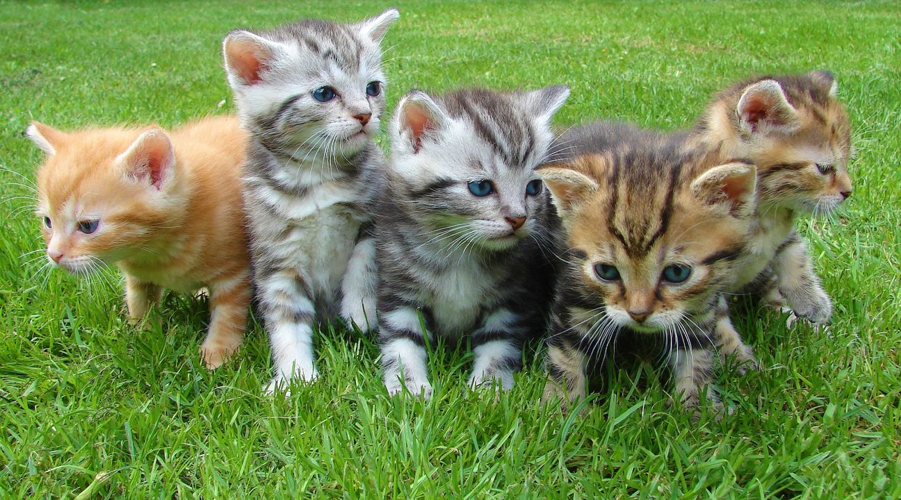
Showcase
By default, the original image is transformed into 9 variants - 480/1024/1920
widths at avif/webp/jpg formats, with an inline base64 low-quality image
placeholder (LQIP) background.
The LQIP is typically a 16px webp;base64 data URI at about ≈150 bytes.

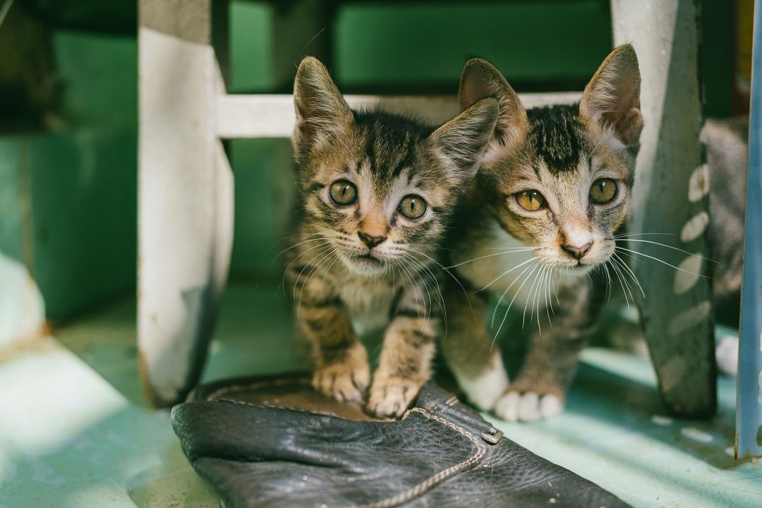
It's not recommended, but you can apply a Gaussian blur backdrop-filter.
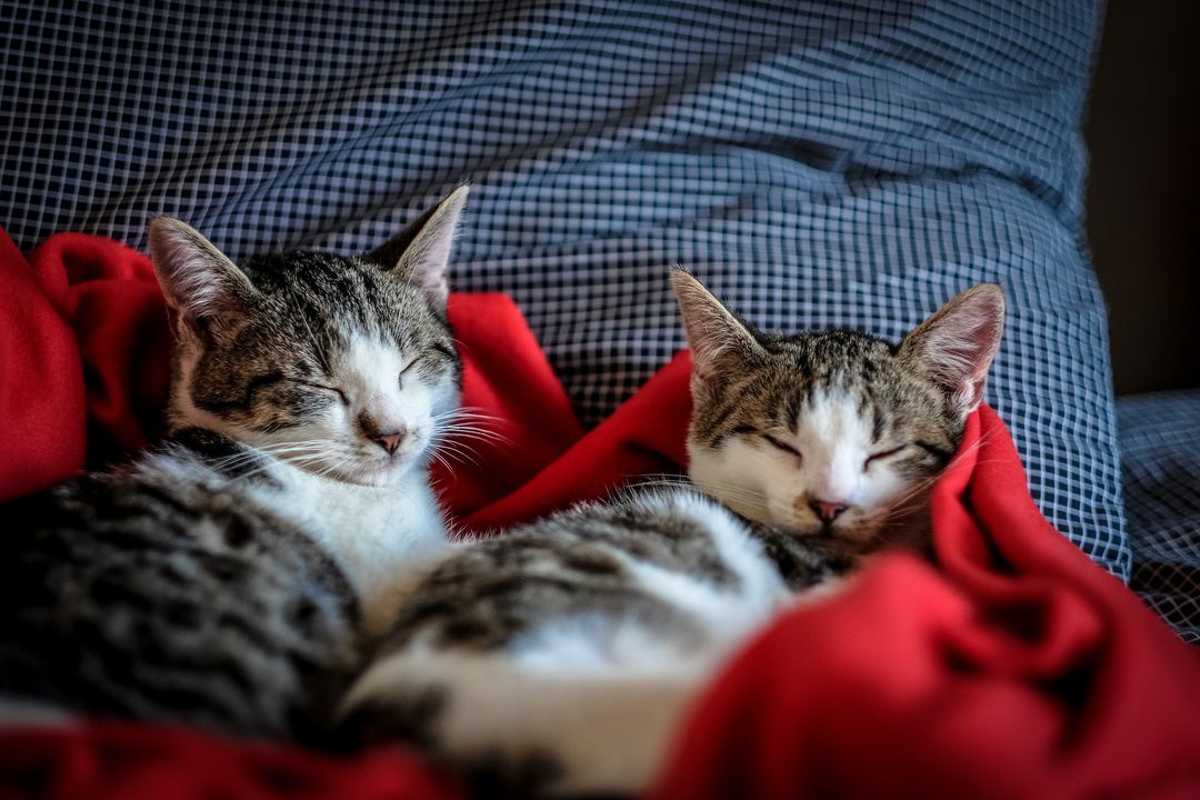
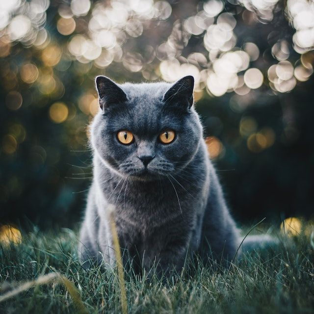
Not much difference, is there? The next image has a dominant colour placeholder instead.
Which looks like this.
You can also reveal images with fade-in special effects.


Or even apply parallax scrolling special effects.

Thevercel-imgcomponent tries, as much as possible, to be a drop-in replacement for the native HTML<img>tag.
Side-effects are kept to a minimum, so things should still work even without JavaScript. Try it - disable JS on this page and refresh, and check out the Lighthouse score too.
The next example however does require JavaScript, because interactivity. It uses the
Vite pattern for glob imports to load a local directory of images, like so:
const modules = import.meta.glob('$lib/assets/sm/*.jpg', {
  import: 'default',
  eager: true,
  query: { w: 640, h: 640, fit: 'cover', as: 'run' }
})

const images = Object.entries(modules).map((i) => i[1])


